Project Information
Reflct is a user-first platform for curating, managing and deploying 3D scenes online. It harnesses the power of a clever volume rendering technique called Gaussian Splatting, which enables the viewing of high fidelity 3DGS (3D Gaussian Splatting) environments in real time. Reflct brings this into the browser in a user-friendly package, with an intuitive backend dashboard for managing scenes and camera angles, and a clean, embeddable 3D viewer designed for product pages across ecommerce.
Taking a step back, in 2024 I was approached to visually bring this new idea to life. At that point in time, Reflct was a name. No brand, no website and the back-end dashboard was a rough prototype. And so the work began.
My early inspiration appetite consisted of tech products that feel approachable, expressive, and human. Just because a product is built on complex technology doesn't mean it needs to look it.
Since Reflct is about mirroring the real world in a hyper-real digital space, I started by exploring motifs of reflection, refraction, ripple, and repetition. Patterns, shape, and form began to manifest. I knew early on that the brand needed to feel clean and calm, minimal and contemporary, with the flexibility to sit comfortably across sectors like homeware, automotive, furniture, real estate, art and more.
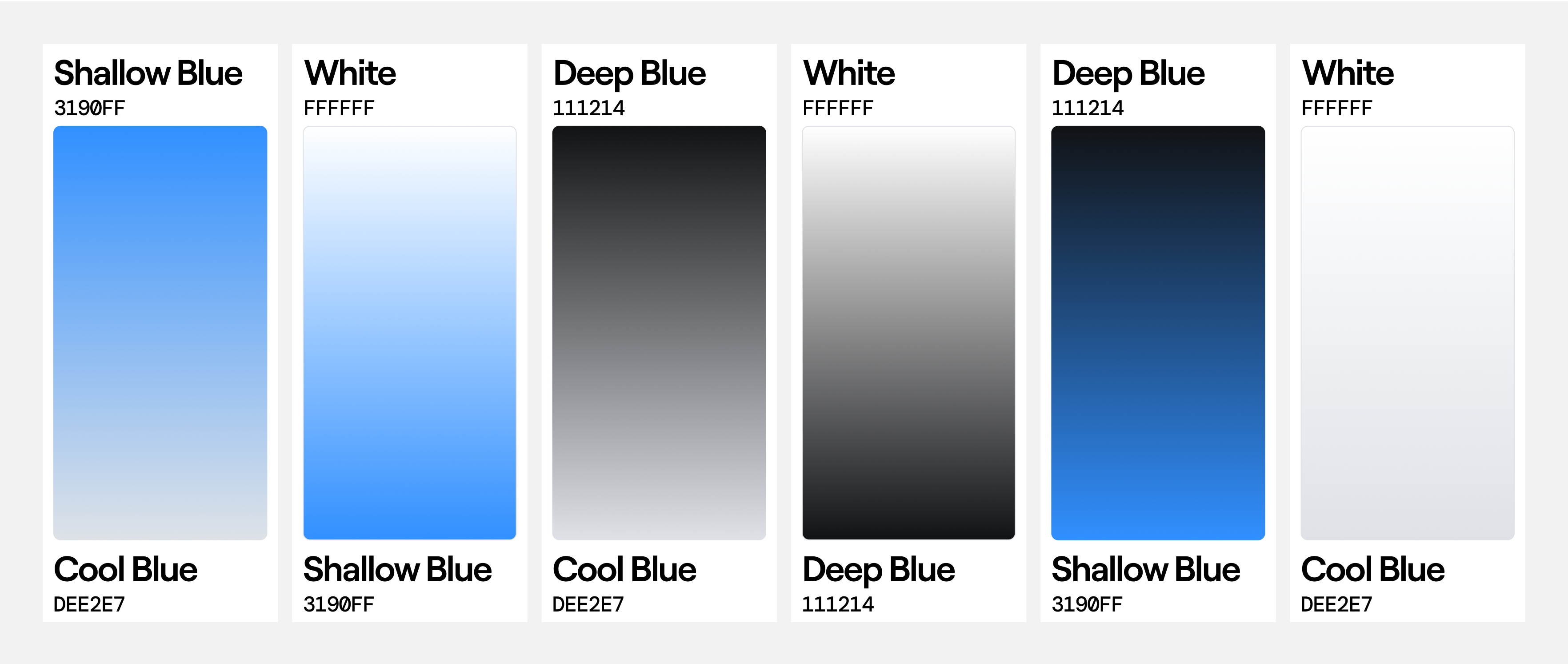
The colour palette consists of a range of blues, chosen to evoke clarity, trust, and a sense of lightness. The off-grey has a blue undertone which gives it a mirrored surface feel when paired with pure white.
Roobert was chosen as the primary typeface for its clean geometry and smooth angular connections. This was used as the base for the logotype, and to echo the theme of reflection, an array of glyph fragments were added to follow the baseline. I paired this with DM Mono to bring in a slight technical tone, just enough to speak to the product’s function.
The logomark is constructed from a series of repeating angled rectangles. Mirrored along the y axis, they allude to perspective, duplication and depth, reflecting core ideas behind the product itself (pun intended). The mark is designed to be stretched allowing it to live in and adapt to any composition or space. To increase harmony between the logotype and the logomark elements, I rounded the corners.
From there, the identity system grew into a flexible brand kit that could be applied across digital touch-points, supported by usage guidelines.
Once the brand was in place, I moved on to the UX and design of the backend dashboard, where users upload and process scans, manage scenes, set views and groups. You can preview defined camera views in real-time before deploying the scene to your integrated website, getting a sense for how customers will view your product in situ.
Finally, I designed the Reflct marketing site, a single scrolling page that walks new users through the product’s key features, pricing, FAQs, and open beta sign-up. This was the perfect space to really stretch the new identity.
The result is a cohesive and elevated design system that speaks to the product’s technical depth while staying friendly, simple and grounded.