Festival of Live Art
F.O.L.A.

Project Information
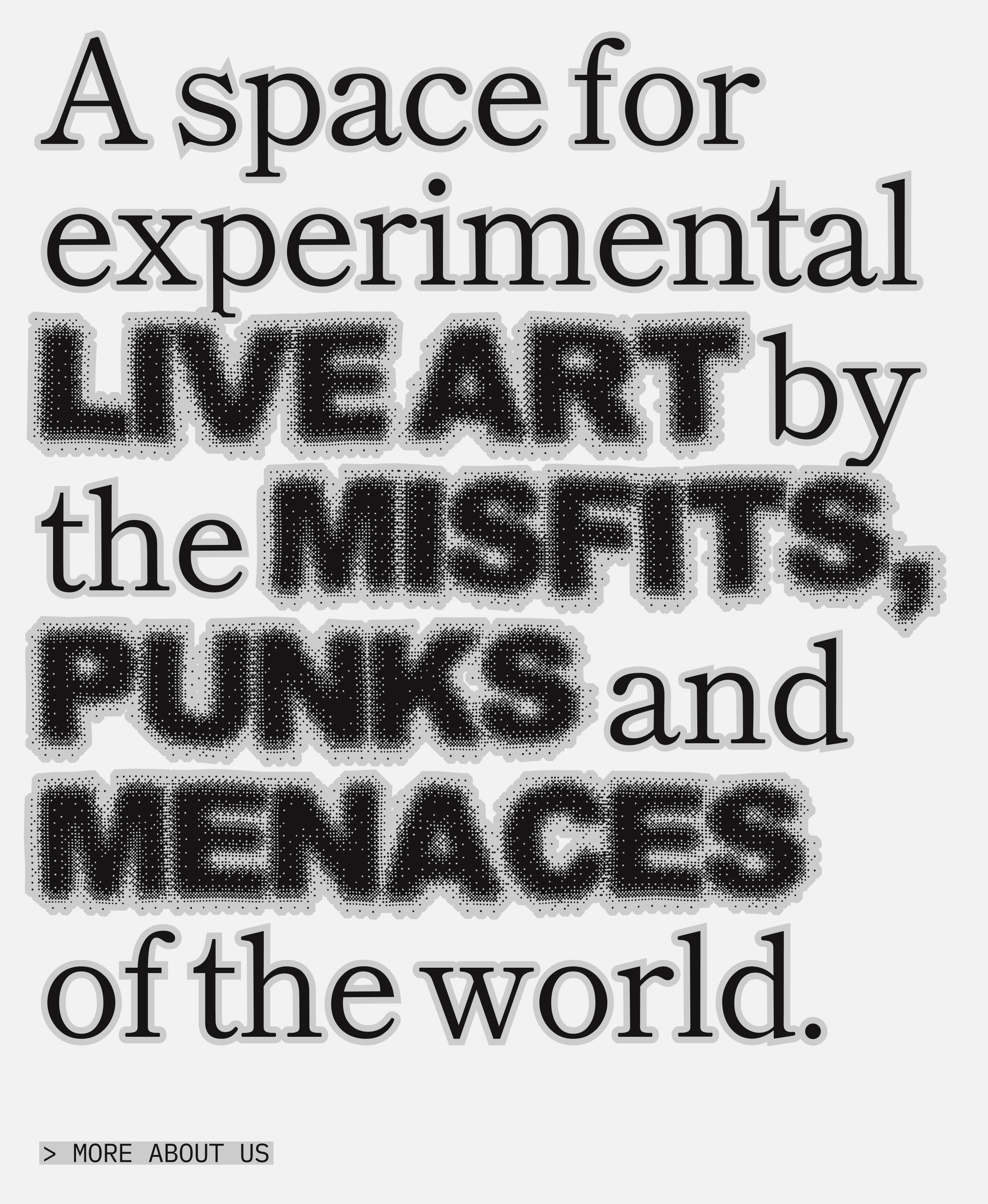
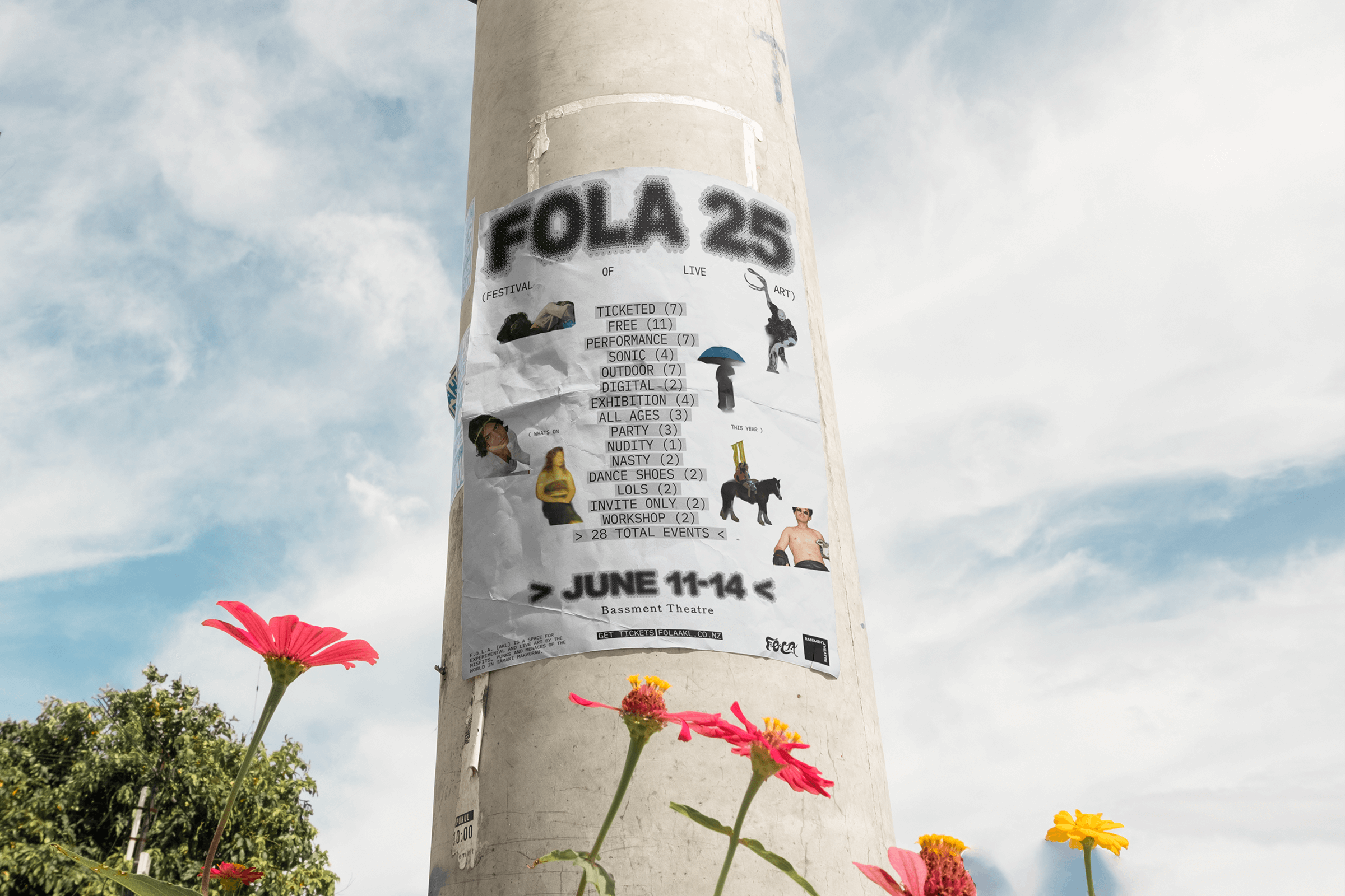
F.O.L.A. (Festival of Live Art) is a bold, celebratory platform for experimental performance—created by the misfits, punks, and menaces of the world—held biennially in Tāmaki Makaurau. Each evolution, a new collection of artists, provocateurs and cultural makers come together to push boundaries, bend genres, and reimagine the role of art in public life.
In 2024, I was engaged to lead the design a new digital home for FOLA by creating something that could hold the energy and intensity of the festival, honour the work of artists past and present, and support the changing shape of each season. A site that could shift and stretch year by year, but still feel unmistakably like FOLA.
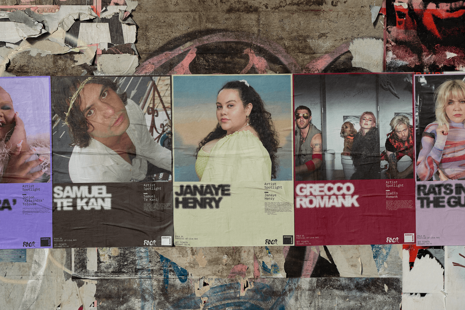
With every evolution of FOLA, a new artist is commissioned to lead the festival campaign, bringing a fresh visual identity to every season. The core idea was to hold space for change. Rather than create a rigid template, I designed a flexible frame, one that allows the biennial campaign to take centre stage, while still holding together as a cohesive, ongoing experience for years to come. It was about building something alive — a platform that could shift tone and colour, adapt to new ideas, and make space for every artist to be seen on their own terms.
The design is unapologetically bold and playful. A flexible but characterful set of unique typefaces were chosen to build equity in the FOLA brand: a mono offers a tight grounded rhythm for body copy, a serif brings a touch of ceremony to quotes, and a buzzing display typeface injects a sense of movement and mischief. With the help of graphic designer Jacob Davies, we modified the display typeface to support macrons, acknowledging the role of FOLA as a Tangata Tiriti led festival.
The FOLA colour palette is deliberately subtle. A base of deep brown and off-white gives colourful festival and artist content its own visual atmosphere while ensuring colour contrast accessibility. Additional artwork can be found throughout, cleverly tucked behind interactions, animations, and even in playful moments like on the 404 page. I wanted the website to be a place of play and discovery, with every area giving the FOLA identity space to breathe (or shout).
Inspired by recurring themes in past campaigns — the sun, moon, and passage of time — I designed a shifting hero component that follows the time of day in Tāmaki Makaurau. The homepage transitions through Sunrise, Daylight, Sunset, Twilight and Moon Time, with ambient audio that shifts in tandem and plays in the background as you explore.
Throughout the website design and build, I worked closely with the team at FOLA and the artists to bring their vision to life with care and intention.
Project
Festival of Live Art
Client
F.O.L.A.
Role
Lead Design & Art Direction
Year
2025
With
Jacob Davies
Website
www.folaakl.co.nz