Project Information
Axis Awards is a creative award show held annually in Tāmaki Makaurau, celebrating the best in advertising and design.
Each year, the show evolves without a single defining element underpinning its identity. But in 2024, a pivotal shift took place with the introduction of a redesigned sustainable trophy and a refreshed ceremony identity—marking the beginning of a more unified system. In 2025 I was appointed to lead the design of the 44th annual Axis awards ceremony. My goal here being to not only design the 2025 ceremony, but to also build a distinctive brand platform to create lasting recognition for Axis.
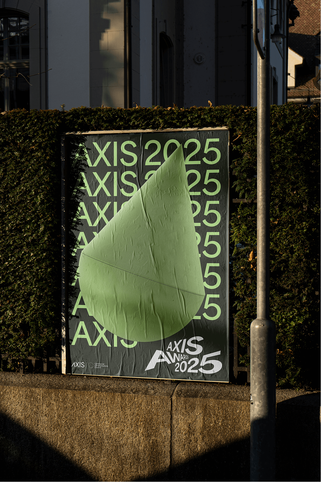
I began by first simplifying the master logo mark introduced in 2024—removing the ‘2024’ and aligning everything to the baseline. The mark directly reflects the trophy’s unique ‘A’ letterform but remains subtle enough to sit neatly in the corner of collateral, locked up with the Comms Council logo. Axis now have a clean, consistent master logo to use year-round—helping to build awareness and brand equity into the future.
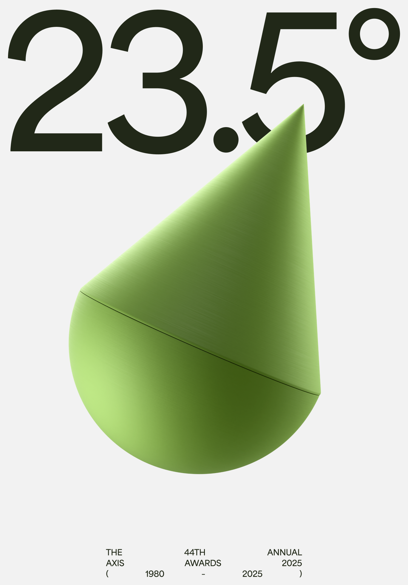
With the master brand in a good place, I began to think about how I could bring the 2025 ceremony to life with an identity of it’s own. The Axis trophy leans at 23.5°—the same as Earth’s axial tilt. This concept became a foundation for my design thinking throughout the project.
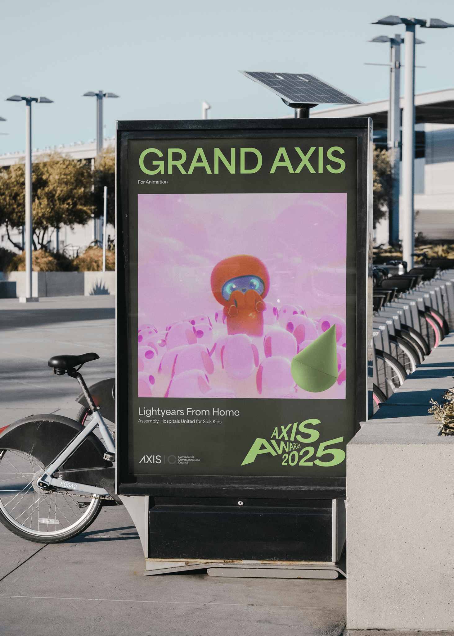
Inspired by Aotearoa’s natural palette, I developed an ownable set of colours for Axis. I wanted them to feel independent, sustainable, and contemporary. Market research showed an opportunity to lean into green, which I paired with neutral greys to form a bold palette that stands apart. This palette comes to life in the new Grand Axis trophy—showcasing the new sustainable green and representing the pinnacle of creative excellence. Only two of these are handed out each year so I wanted to make it a real statement piece.
I also noticed Axis has never really had a nice set of badges like Best Awards or D&AD for example. So I simplified the trophy shape and created a set of legible badges for agencies and studios to use on their websites and socials.
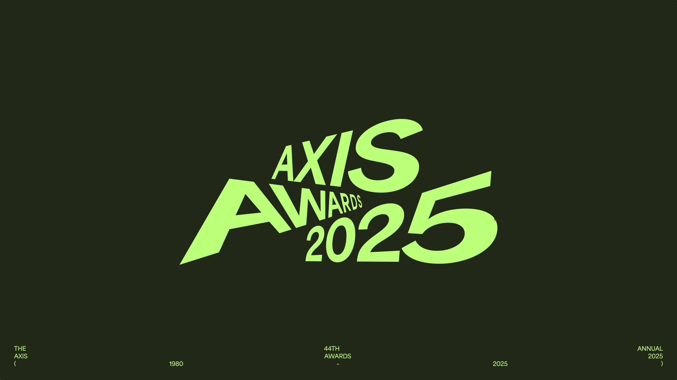
Axis were already using a nice typeface called Area—a variable geometric font with the kind of forms I felt complemented the wider design system. I used three weights: Semi Bold, Bold, and Extra Bold, and applied various treatments like stretching, tilting, perspective warping and rotating—echoing the 23.5° tilt—for things like headlines. This typographic treatment was used to arrive at the Axis AWARDS 2025 ceremony logo.
Finally, I brought everything together into a tight guidelines document, and worked closely with the Comms Council and production teams over at Kiio to bring the event to life in a faithful manner.
I’m already thinking ahead to 2026, and how I can continue evolving this brand system—setting Axis up for a strong and cohesive design future.


